GrAphics & Illustrations
The singing beetle

'The singing beetle'...
The Music of Red Dead Redemption II

'The Music of Red Dead Redemption II'...
God Save The Queen Bee
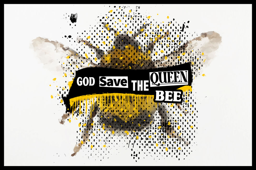
'God Save The Queen Bee'...
Characters of Cuphead

'Sully The Skeleton' is another additional character I designed based off the video game 'Cuphead'.
This skeletons body follows the same anatomy as the main character cuphead. I didn't give the character the two extra bones you would find in the arms and legs due to shortness and design of the character. I also only drew four ribs due to the size of his shoulder and hip bone. His shoes and gloves are an exact duplicate of cupheads but his head is a skull which gives the character some extra height.
'Rollie The Dice' is my second design dedicated to the video game 'cuphead'. This took the design of a common object such as a dice and turned it into a 1930's cartoon character. One of the main antagonists of this game is a dice (King Dice) which owns a casino.
I wanted to create a good guy character you could possibly unlock to play as once you've defeated him maybe on a certain difficultly. I gave him a bowtie to make him look smarter and possibly related to the king dice boss.
'Vinnie The Vinyl' is my first dedicated piece based on the video game 'Cuphead'. This game is a 1930's rubber hose style where each frame of animation is hand drawn. The backgrounds are also all hand painted into the classic static background style of the 1930's cartoons.
My design is a record/vinyl which whistles as it walks. I designed his arms and legs to be thinner than normal as the thicker lines made the character looked disproportionate. because the main colour was black his eyes had to be mainly white.
Grim
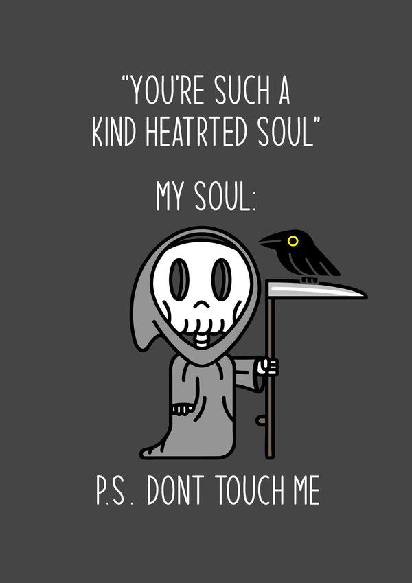
'Grim' is a piece which I created for a possible birthday card design. The design is based on the split personalities people display by being lovely and nice but actually deep down a sinister person in many ways. The design used a certain thickness of lines throughout in a modern rubber hose style.
The Famous Old
'The Famous Old' are pieces of work which places old legends from the 40's, 50's & 60's styled in an oil painting design. This style of mid century oil paintings are commonly in museums of biblical/religious events and historical leaders of the world, like King Henry Viii, napoleon and George Washington as Paintings were the only way to evidence an image of a person or place before the invention of photography. Photo's were then used to instantly capture the moments through time and many of the older pop culture figures through 40's to 60's would have been photographed. With the world turning like a clock these legends feel just as long ago as the historical leaders and events which were painted. This ignited a theme I would evolve into 'The Famous Old', photos re-imagined as oil paintings of our famous pop culture icons.
The Journey Home

'The journey home' is a design for a fictional audio book which started by looking at photos from 'unsplash'. I had seen this image i knew i wanted to use it but initially i didn't know how. I then played around with some titles and decided on an audio book. I changed the colours and setting to look more like a sunset and added the partially seen moon at the top right to help set the time of day.
On The Rocks

'On The Rocks' is an additional piece i wanted to create for the musical alphabet illustrations. This piece is dedicated to a new favourite band called 'Midland'. Their country music style is unmatched and unique.
The design started with the image which I found on unsplash which was a landscape i hadn't seen before with the rocks looking like broken tree's or large icebergs. This resemblance connected the name 'on the rocks' which was the name of their first commercial album.
Music Alphabet
Music Alphabet is a collection of work which follow the musical alphabet: A to G. Each piece is connected either by the artist or song to the letter. the main idea was ways of learning new skills at each challenge.
Wish you were here!

'Wish you were here!' is a dedication piece to Olivia Steele's art by the same name. Her piece is a picture of a nuclear bomb mushroom cloud with a neon sign with the words "wish you were here". I used different images for the background but also tried a different phrase which are lyrics to Vera Lynn's 'We'll meet again'.
buzz the astronaut
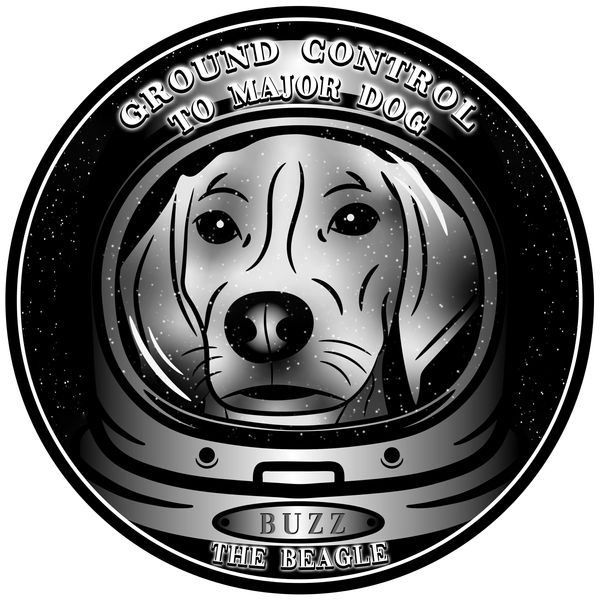
'Buzz The Astronaut' is another piece based on Buzz the beagle. This time he is being referenced to Buzz Aldrin the astronaut. I had taken a photo of buzz's face for reference and illustrated over it. I also illustrated a basic astronaut helmet with a star covered background with stars also appearing in the reflection of the helmet.
The top quote are worded lyrics taken from David Bowie's song 'Space Oddity'. The lyrics are "This is ground control to major tom". I re-worded for a funnier type pun for the piece of work as it felt it needed more after completing the illustration and base design.
Fossil Fuels

'Fossil fuels' is a simplistic pin/badge design to raise awareness about the effects of using these types of fuels and the effect they have on our planet.
Nevermore

'Nevermore' is a design I had set myself to create a simple raven illustration and then create a product which uses it.
The raven is also poem by Edgar Alan Poe which is a horror story about a mourning man who has lost his wife Lenore when a raven taunts the man only saying 'Nevermore'.
This is known by many as one of the greatest and the most popular poems ever and amongst other literary artists.
Because the raven is so well known by poets along with the words 'nevermore' the raven illustration fitted perfectly. The Raven has a very simple and rounded design that is more friendly then menacing, so I decided to make it the title for a book of poems for young children. The original Raven poem would not feature in the book due to its dark themes but maybe a funnier version would be perfect.
The Stag

'The Stag' is a design for a self appointed project to create a Pub sign/logo. I wanted the pub name to be "The Stag" which is a popular pub name across the united kingdom with one in Attleborough, Norfolk. I used a Victorian type font, most pubs still have a Victorian style which some refer to as 'old English' which spans from 1800's to the 1900's. I wanted the design to look modern with a heritage or history.
The Stag illustration I designed with bold thick lines with little detail to stay modern and simplistic. The design came out better than intended and was used again on another design for a picture record for a favourite song of mine.
FREE HUGS

'FREE HUGS' is a piece dedicated to raise awareness that manatee lives and habitat are in danger. For more please go to: https://www.savethemanatee.org, thank you.
Squirtle Squad patch
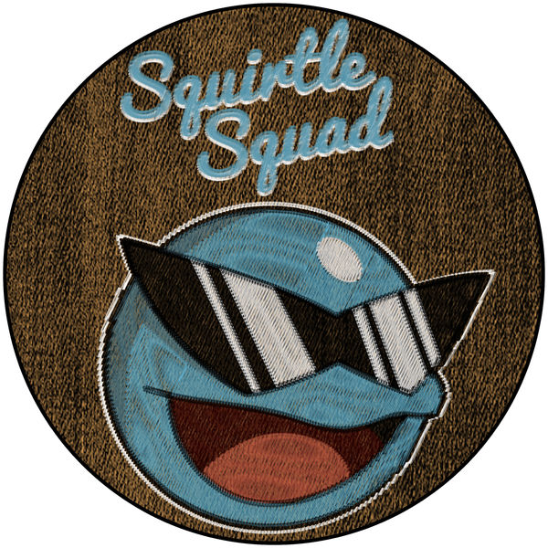
Squirtle patch is a design which I created previously for the 25th anniversary of Pokémon. I have taken this design and applied a patch type effect on a denim texture to see what it would perhaps look like as a textured patch.
PLAY has no limit

Play has no limit is a poster design influenced by the original PlayStation buttons palette. The colours used are those of the original controller for the PlayStation 1, The red circle, pink square, green triangle and blue x.
PlayStation hasn't presented at E3 2021, or 2020 & 2019. Gamers hope they bring their own presentation about future games to let the fans know how things are progressing and what we should be seeing in the future.
Guide to the galaxy
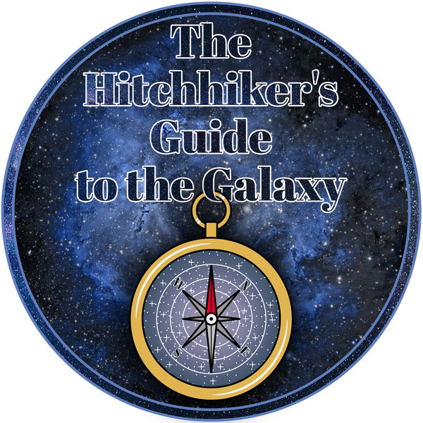
The hitchhiker's guide to the galaxy was a radio show which was adapted into a series of Novels written by Douglas Adams. The main novel has also been converted to Tv, film and stage show.
This design is rare process where I started create the idea for an illustration which was the night sky as the background for a compass. after completing the illustration and not knowing what to do with it also gave me the idea to incorporate it with a design for Hitchhiker's guide to the galaxy. Although the compass illustration doesn't directly refer to anything within the novel, the concept of a compass with a night sky references to the journey the characters embark on through the galaxy and solar system.
The Fly
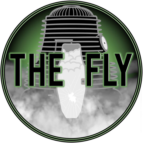
The Fly is a David Cronenberg film featuring Jeff Goldblum. The story follows a scientist who has finally mastered teleportation and when he tests the machine himself his DNA is mixed with a fly which had flown into the machine. His DNA starts to fuse with the fly and is transitioning into a monster fly/human.
The design is centered around the original theatrical release poster which shows a human arm and fly leg coming out of the teleportation machine. The machine was the main focus which had to be movie accurate. I wanted the title to look like it had emerged from the machine itself. An extra detail was the silhouette of the fly on the window.
Although the design doesn't feature any form of the mutated scientist it's key to keep the audience wanting to know the outcome and featured monster design for their own eyes.
Bring Us The Girl
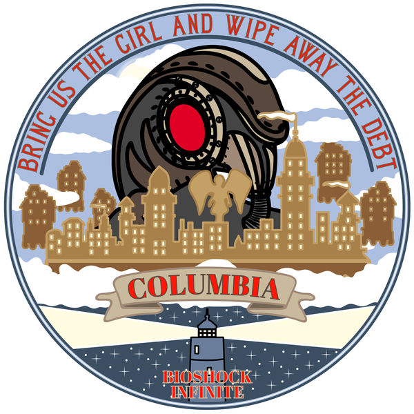
BIOSHOCK Infinite is a first person shooter video game. This introduced a completely new world called Columbia which is a version of the city floating above the clouds.
The story follows Booker Dewitt trying to recover a lady named Elizabeth to try and get his daughter back while trying to remember his broken memory of why he's doing this.
This is the first video game that first explained a multi-universe concept with multiple versions of the same reality you know with slight differences like a dead person being alive.
Would you kindly?


BIOSHOCK is a horror first person shooter video game which introduced an entirely new and bizarre world which is the city of rapture. An underwater metropolis, built in one mans vision who proved it could be done.
This video game has you fighting crazed psychos while boosted on plasmids granting insane abilities like shooting fire balls or a swarm of bee's from your hands along with a arsenal of firearms.
This game features plot twists only a video game could only execute so well without revealing anything to the player along the entire adventure. We often find objective's in video games the aim of the game to complete and be rewarded, so what if the objective we would normally never second guess actually be the result of a mind control phrase. When advised to do something, the person requesting this would utter the phrase "would you kindly" before any request and the player would do as requested, as it would be the only way to progress within the game.
This phrase was the center piece for this work and I wanted it to overlap rapture city. The words "no gods or kings, only man." is a Quote by the builder of this city, Andrew Ryan.
When moving the text around for 'rapture' I saw a second design which made the oval look more landscaped based like a postcard or advertisement. This second design features the word rapture in the background even partially behind the city with an opposite gradient within the lettering to help make it stand out.
Life Finds A Way

Jurassic Park is a classic Spielberg film released in 1993 depicting a scenario where they've taken blood from a fossilized mosquito to bring dinosaurs back to life and present them in a theme park. Before the park is opened to the public its shown to a hand full of scientist and paleontologists where disaster erupts.
The design features the key ingredient in which the science requires to make this possible, the fossilized mosquito. The mosquito sucks the blood of a dinosaur, lands on a tree and is absorbed by the sap and is then stuck and fossilized after millions of years into amber. I've depicted the mosquito in the amber which is the top of the park owner, John Hammonds walking cane.
The quote "life finds a way" is a line said by Jeff Goldblum when the visitors are advised all the dinosaurs are female and could never breed. This comment is a warning and look into the future knowing that life always finds a way to do what it must to survive.
Goooood morning

Good morning Vietnam is a film staring Robin Williams as a radio DJ sent to Vietnam in 1968 trying to help support the troops with his quick fire impression, jokes and music.
the films pushes robin Williams diversity as an actor from stand up improv comic to serious actor. the radio scenes where he's turned up to eleven displays his incredible comedy style with constant jokes and impressions that he shoots out like a machine gun and leaves you no time to breath before hearing the next.
My design takes his famous intro quote he shouts down the mic in the first radio scene. I added the old style microphone as the center piece along with Huey helicopters, a black and white American flag and flames to signify the napalm used in the Vietnam war.
KANTO STARTERS
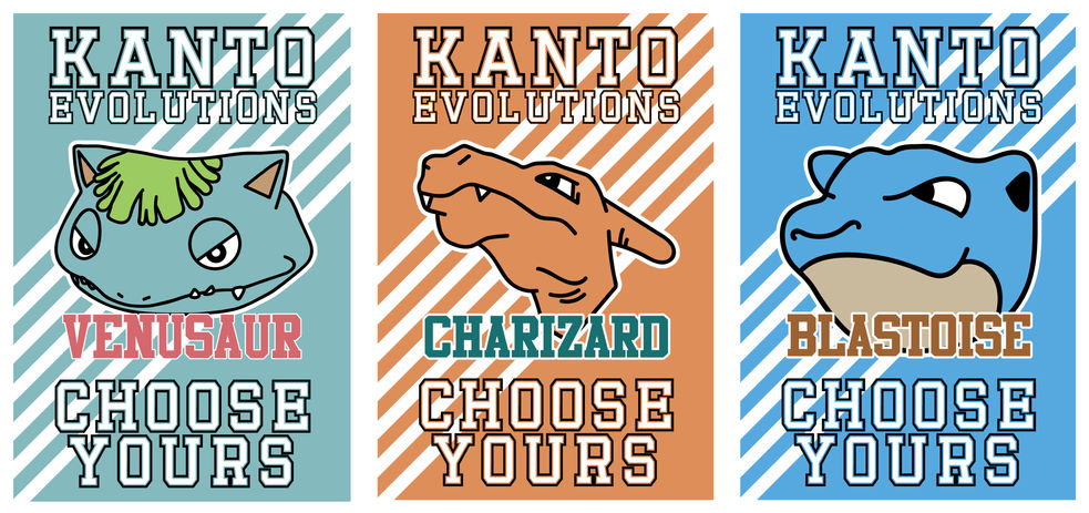
The kanto starters is a poster design intended for the Kanto region advertising the decision to become Pokémon trainers.
It displays the three starter Pokémon final evolutions.
I've got COURAGE

Courage the cowardly dog is a cartoon which follows the horrific dangers and characters that happen to courage and his owners.
Courage is always scared of everything which is a contradiction his name. every episode a new character brings danger to there small wooden shack in the middle of nowhere and courage has to pull through and save the day. for a children's cartoon these dangerous characters were like something from a nightmare. Some have a funny element but like many some children found some episodes terrifying.
My design was originally in colour but the intro to every episode was on an old black and white tv so I decided to implement this into the colour scheme.
I had the words "i've got courage" but an image of courage the dog screaming his head off when he's normally been shown the new danger for that episode.
I added Muriel and Ustes Bagge, courage's owners, to help fill in the circle design. The background is a wooden texture similar of the house they live in.
show us the hook
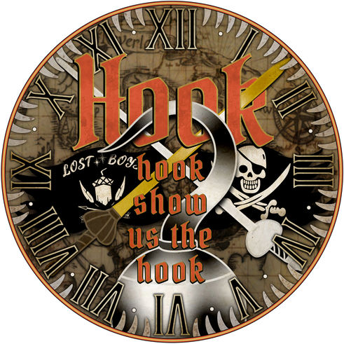
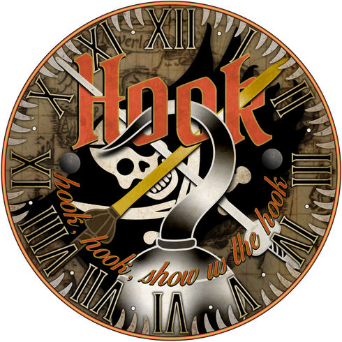
HOOK is a 1993 film directed by Steven Spielberg featuring an all star cast. the main character is portrayed by Robin Williams, a grown up peter pan who's forgotten who he truly is. He's dropped into neverland in search for his kids who have been kidnapped by the infamous captain hook. The film follows peter going through a journey of self discovery with the help of tink and the lost boys to fight captain hook and save his kids.
This film is still my favorite rendition of a peter pan story and everything it brings. The design came from the classic movie poster showing captain hook's famous body part. I knew I wanted the hook to be going through the word 'hook' to physically connect the two. I chose the slogan the pirates chant when we first meet captain hook, "hook, hook, show us the hook".
The swords are peter pan's sword which is given back to him after proving himself as pan, and captain hook's rapier. The clock face and crocodile teeth around the outside plays homage to the crocodile clock tower in the film which is captain hook's formidable foe 'the ticking crocodile' which he turns into a clock.
Party Time, excellent
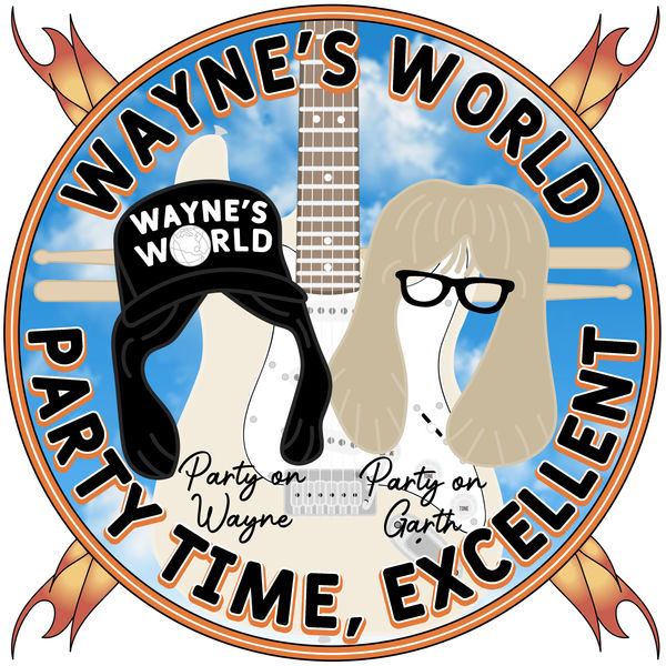
It's Wayne's world, Wayne's world, party time, excellent!
Wayne's world is originally a SNL (Saturday night live) sketch which had two movies made starring Mike Myers and Dana Carvey.
The films follow the two main characters Wayne and garth and their lives with some laugh out loud moments and rock N' roll soundtrack featuring many celebrity cameo's.
GOT MILK?


GOT MILK? a reference to the milk campaign slogan "got milk" which made milk trendy and helped younger people drink more milk.
Today we live in a world with our necks arched over a device which we now see the world in. This device is our mobile phones and in todays world people can't live without them.
Sometimes we need to look at ourselves and what we do daily and understand this isn't necessarily good for our wellbeing and health. These devices wont extend your life, instead they will drain it. Showing what other people in the world are doing with their life and possibly leaving us at the end of ours thinking what did I accomplish apart from seeing what everyone else accomplished.
The mobile phone isn't a part of us, you don't always need it, you don't need to check it. Don't forget its not a part of you, so don't let it control you.
In the Jungle you Must Wait

Jumanji is a tribute to the 1995 film starring Robin Williams and bonnie hunt. This adventure film follows the story of a boy who finds a board game in 1969 and is trapped inside Jumanji until he is released 26 years later by a couple of orphaned kids who have moved into his old house who find the game and start playing.
This was a favourite film for our family and combined adventure, horror, fantasy and comedy with every roll of the dice.
"I've seen things you've only seen in your nightmares. Things you can't even imagine; things you can't even see. There are things that hunt you in the night. Then something screams. Then you hear them eating, and you hope to god that you're not dessert. Afraid? You don't even know what afraid is."
The design started from the idea of the quote "In the jungle you must wait, until the dice read five or eight." This was the point where Alan Parish is sucked into the game and sent to the jungle where he would stay for 26 years.
I initially started recreating the board with the center screen showing the quote and building around that. this lead to the design of the four animal playing pieces (Elephant, rhino, crocodile and monkey). I then stuck with the similar colour scheme for the Jumanji title text and included the games catchphrase "A game for those who seek to find, a way to leave their world behind". lastly I added the four icons on the front cover of the board game which helped fill in the empty spaces within the design. An additional touch was adding the two main actors names either side to help with additional blank spaces within the design.
Mermaid Man & Barnacle Boy
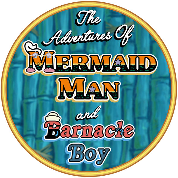
Mermaid Man & Barnacle is a piece dedicated to the crime fighting duo which exists within the spongebob squarepants universe.
These guys were retired super heroes similar to an Adam west batman & Robin, and dressed similar to aquaman. They drove an invisible boat mobile and battled with villains like 'Man ray' and 'the dirty bubble'.
The design of the font was to portray their iconic outfits through the font. With mermaid man I included all his key features; Shell bikini, starfish nose, pink fluffy slippers and white pompadour hair. Also included was the main outfit layout of orange top, 'M' figure belt and black scale bottoms.
Barnacle boy had the same approach and applied his Sailor hat, handkerchief cape and eye mask. The word 'Barnacle' combined his red top and black bottoms. the word 'Boy' represented his rubber gloves.
Johnny b. Goode
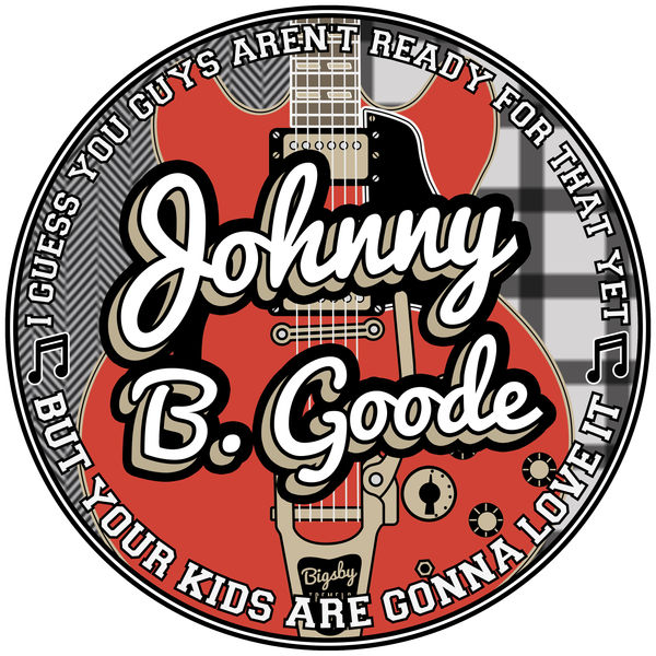
Johnny B. Goode is a song by chuck Berry. this song is covered by Marty McFly (Michael J. Fox) in the first back to the future film at the 'Enchantment under the sea dance'. Marty performs this song in 1955 which hadn't even been written or released at this point. The inside joke shows one of the band members calling his cousin Chuck Berry and says "you know that new sounds your looking for, well listen to this!".
Near the end of the song Marty starts playing some experimental solo riffs which haven't been heard yet in the 50's. At the end Marty realises he's stunned the audience due to his playing and hands back the guitar. He says "I guess you guys aren't ready for that yet... but your kids are going to love it.
My design was centered around the Gibson 335 guitar which was an iconic piece. Adding the quote used helps tie the two together along with his blazer and shirt designs as the background.
I decided to use the song name 'Johnny B. goode' as the center piece with a 50's hand drawn style design.
Banana GUN
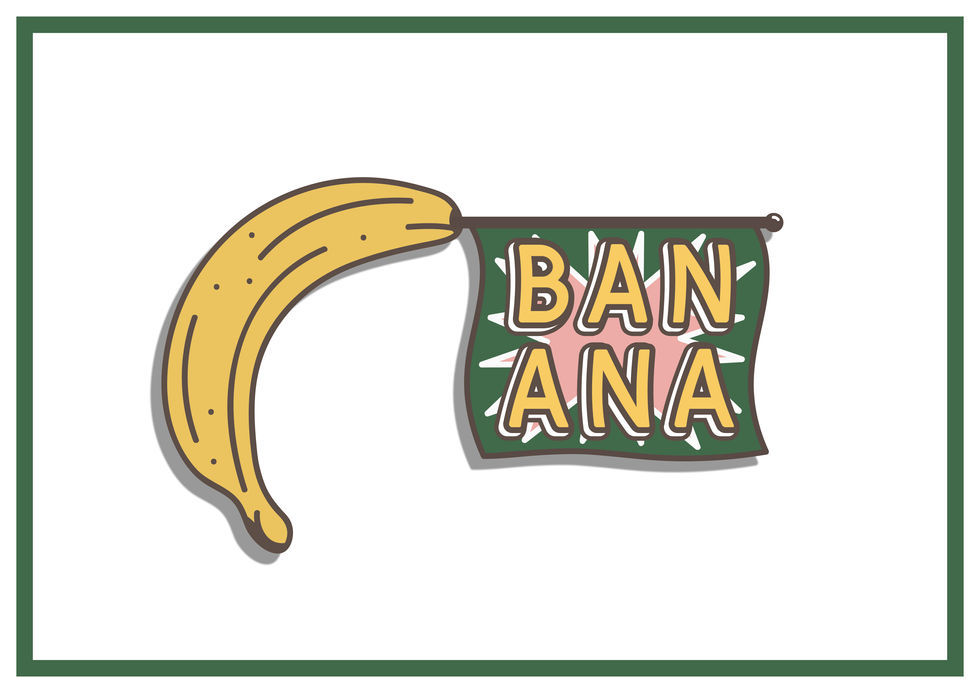
BANANA GUN is a concept which references an old wives tale.
The statement is "Eating more than 6 banana's in a day can kill you". This isn't true. Due to the potassium levels in bananas you would need to consume over 400 bananas a day to build up the potassium levels to have a negative effect on your heart and body.
The idea of banana being able to kill you pushed the idea. Due to a banana being shaped like a gun (when held in a certain way) gave me the idea to add a classic fake gun BANG banner. I originally had intended to use the words 'BANG' but the word 'BANANA' fitted perfectly and referenced what im portraying. This all helped the illustration to link it with the concept that eating several bananas a day can't kill you. A banana is just as harmless as a fake gun, or an apple.
THE HOLY TRINITY

The Holy Trinity is an idea which developed from the love and dedication fans have towards STAR WARS (including myself).
People fall in love with the franchise whether they only watched the movies or tv shows, played the video games or countless books. People will go (and have gone) out their way to learn a mastery knowledge of the universe. This is a more complex universe than our own with dozens of planets and a few hundred characters all with their own back story with more being written every day.
This fictional sci-fi film franchise started with one mans vision and has imbedded its values and story into our brains.
Over 10,000 people identify their religious beliefs as 'JEDI'. these are the fans like many of us that would pick up a STAR wars boos than a bible. Star wars is bigger than religion.
MAggie lost her baby legs

Maggie lost her baby legs is a notable comment from the treehouse of horror IX segment called 'Starship poopers'.
In this episode Maggie has her first tooth which is really a fang. Homer then is playing 'this little piggy' with her toes when her legs drop off. Homer then turns to marge and says;
"Look Marge, Maggie lost her baby legs". She then grows tentacles and we discover her father is Kang the alien.
I'm no Superman [SCRUBS]

I'm no superman is an illustration I did in admiration to [scrubs] the tv show.
Created by Bill Lawrence, a comedy show about hospital life. the series spanned from 2001 til 2010 with 9 seasons and over 180 episodes. The show follows JD (Zach Braff) and his friend Turk (Donald Faison) go through hospital life as a doctor/surgeon with witty comedy and skits thrown in.
I had watched episodes during my teenage years and came across a podcast in 2020 of zach braff and Donald Faison (fake doctors, real friends) watching each episode and then discussing filming that episode with a guest each week.
The series was recently added to the streaming service 'Disney+' which has allowed me to watch the entire show.
The words '[I'm no] superman' are the main lyrics for the intro theme 'Superman' by Lazlo Bane.
I added the brackets on the words 'I'm no' to show it doesn't really apply because doctors and nurses are incredible, and are the real superheroes who save lives every single day.
Squirtle Squad
Pokémon's 25th anniversary


Squirtle squad is a piece dedicated to the 25th anniversary of Pokémon.
Squirtle is my favourite Pokémon and in the first series of the anime cartoon Ash KEtchUm the protagonist comes across a group of Squirtle's causing havoc and call them selves the 'Squirtle squad'.
Buzz the beagle
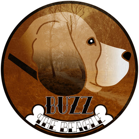
Buzz the beagle is a personal piece. this was made for a friend who owns buzz the beagle.
I used elements that were connected to my friend and his dog.
I used multiple scenic views as a background for this piece and settled on a beautiful woodland walk & stream from 'unsplash'.
LAST LIFE - COLOUR

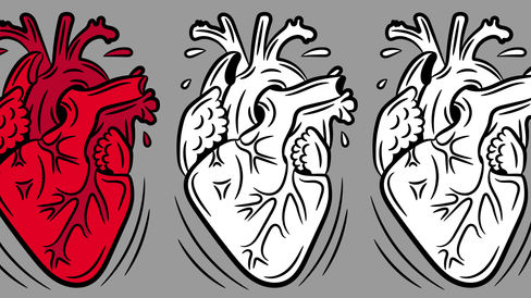
After reviewing other heart illustrations I decided to add an additional colour, Red. The most associated colour of a heart.
I played around with the colours for the text and experimented with gradients.
My favourite styles are #2 + #4. using a Simple drop shadow this makes the text visible even from a distance.
The Truman Show

We are living in a Truman Show World. People show everybody everything. People are actively seeking recognition from strangers. Privacy will soon be obsolete.
I originally designed the moon style illustration. But the more research I did I cam across the idea of adding the cloudy sky with the steps leading up to the exit door. This gave the text an even more deeper connection due to the end scene where Truman says the text above before leaving his televised life he had known nothing else from.
BLUE MILK CREW
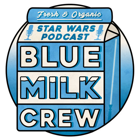
BLUE MILK CREW is a STAR WARS podcast.
The name was decided on after filming the first episode. This was due to the milk topic reoccurring throughout our conversations.
I knew the design had to be modern, soft and rounded with a vintage feel. A keen star wars influence had be present but I wanted to also give the feeling of the possibility it being a real product you could buy.
Another element which I needed to include throughout the design was that the viewer knew it was a podcast this logo was promoting.
The final design has exceeded something I didn't think I could create. I applied my skills and knowledge and has taught me alot about what visually looks appealing and what doesn't.
Once I had layed down the overall outline and design, a large quantity of variants were created with small differences to review what looked better and what detracted your eye.
A small key detail which I wanted to include after settling on the majority of the design was the lightsaber which in place where the attached straw would be.
DEER HUNT

'DEER HUNT' is a personal design which was inspired by my love of woodland nature and the STAG. The inspiration came from the many amazing designs i've seen on 'pintrest' and gave me a challenge to try and expand my design skills.
The skull the first part of the design which I reflected onto itself. The arrows found its final placement through the eye sockets of the skull which gave a greater sense of death and pain.
The words 'Deer Hunt' were the best fit from many options. The 'EST 1994' is the year I was born. This helps the piece to stay personal.
After deciding the font type I added some shapes to help give the design more attractiveness. an upside down triangle was placed dividing the text more along with modernizing the design.
DIE LAUGHING
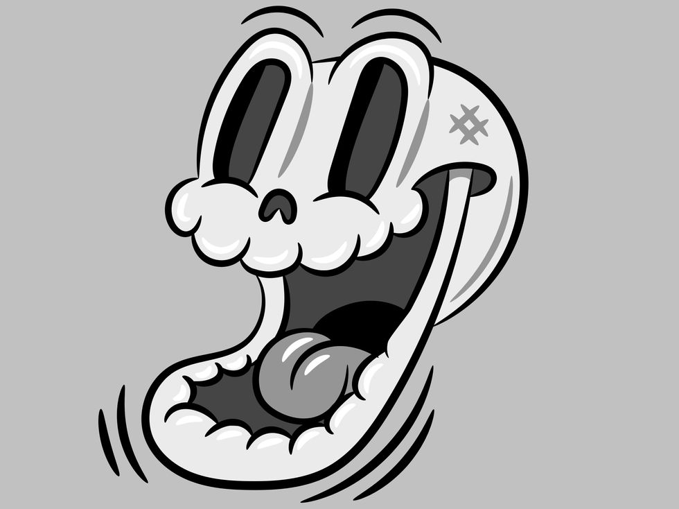
DIE Laughing is a motto I try and live by. Lives not worth living if you go through it without a laugh.
The idea came from viewing multiple inspirational illustrations via pintrest to do a skull in the rubber hose style.
I decided to go with an open mouth design, but the idea of the character laughing hadn't been thought yet. As I continued with the design I realized it took more of an laughing emotion that planned which then gave me the idea to see what that would look like. I added the lines below its chin to give the impression its moving like a laughing jaw would. Also the raised eyebrows helped to bring that laugh across.
As it seemed I was continuing to go down the route of playing homage to classic cartoons, The laughing part made reminisce of the Looney Toons (bugs Bunny, Daffy Duck, porky pig etc). The skull reminded me of the mischief and danger these characters used to cause to each other. So The skull symbolized the destruction that these characters caused and that no matter how much TNT they used their only job was to keep us laughing.
so, don't worry that a rabbit could bend the barrel of a shotgun towards to the hunter that would unknowingly shoot himself in the face but only have gunpowder soot across him to indicate he took a shotgun shell to the face.
I'm slightly proud not every kid watching those cartoons tried to recreate these dangerous stunts. Times were very different then, and maybe kids were smarter back then too.
Logo REDESIGN


After countless hours of practicing and illustrating thumbnails using the 1930's rubber hose style for The Game Opinion SHOW, I decided to illustrate my face using these techniques.
above is the final result after hours of design and rearrangement for every line and shape until I was satisfied with the final product that resembled my face and features. This design went through many change. Every feature went through many designs to accomplish the overall look and shape.
Designing this opened my palette of skills and a better understanding of features on a face.
Last Life
Last Life is a design which was an idea for a video game company but could also be incorporated into a clothing brand.
The design and theme resembles the 1930's rubber hose cartoon style which is a personal favorite style. after completing the design I played around with the effects through photoshop to come across a negative effect which reversed the white to black and vice versa. This gave the design a completely new alternative look using white lines and a dark grey background.
The three hearts was an idea to help illustrate the "last Life" idea. Throughout video game history a players lives have been represented by symbols. Mainly a heart shaped symbol. My idea was to represent that through a life like heart design instead of the child drawing representation.
I'm OK

my very first illustration idea.
after downloading illustrator to widen my skills I started looking into what I should possibly do to learn more about the software and how to use it.
I came across some helpful youtube videos which gave guides on how to do certain art styles in illustrator.
The one that caught my eye was a video for a 1950's hotdog graphic. This cheerful hotdog with rubber hose arms and legs along with white gloves and shoes helped me go down a route I would later understand to be my preferred style.
I followed the tutorial as best I could regarding the hotdog design but left me wanting to copy similar image and their 1930's/40's/50's style.
I firstly decided to recreate the most known mouse in the world... but just his glove. The glove is a largely known symbol to all rubber hose cartoonists and admirers. Most cartoon characters drawn within that time frame would most likely to have worn gloves.
But I didn't want to sugar coat anything in my illustration.
I wanted to show the bare bones and damage of the glove and the user. An idea which was partially inspired when I saw a glove with a bone coming out of the wrist part of the glove. This gave me fuel which would push my idea further.
The quote "I'm Ok" is given when someone is describing their mental or physical wellbeing. OK is the middle ground and can sometimes be an indication that maybe they aren't as OK as they say they are. This fitted my illustration perfectly as a cry for help. The hand itself showed the mental and physical damage this character has been through but are still trying to maintain the optimism that they are ok.
Greetings from

Greetings From is a postcard design made popular in 1950's/60's America. This would have the name of the place the person was visiting with smaller images of the location within each letter. A youtube tutorial guide gave alot of detail and how to create this effect in illustrator & photoshop.
I decided I didn't want to strictly do a holiday location, but instead do somewhere you wouldn't want to visit. So I decided on my favorite video game fallout 3.
This would incorporate concept arm from the makers of the game 'Bethesda game studio' and a fan art piece as the background image.
The outcome was a successful attempt at capturing the same feeling as a 'greetings from' postcard.
I may come back to this design and chose a different location but instead use my own illustrations.
THE DAY MUSIC DIED

The day that music died is a tribute piece to the three musicians who lost their lives in a plane crash on the 3rd Feb 1959. These were Buddy Holly, Richie Valens and the Big Bopper. The line "the day that music died" was taken from the song American Pie by Don Mclean who wrote a song about this and how it affected his life and the world. His lyrics are used as the background for each artists name.
Cary's Cakes


Cary's Cakes was a cake baking business which required a LOGO for social media and business cards.
I incorporated a retro 1940's/50's design with bold colours and suitable type fonts which compliment the design.
The American Poster
 |  |  |
|---|---|---|
 |  |
These photography designs can be used for poster and canvas prints. It all started with visiting New York City and I had taken hundreds of photos and wanted to put them to use. I thought about using these images for a more modernized advertisement. Using a san serif font and a simplistic image which is iconic and recognizable to the eye, even without any text the images already explains where it is and what it is. I designed the font to work on all the images I wanted to use. The latest one was the American flag which was taken from liberty island. The American flag symbolizes everything in many Americans and what America stands for. The words "Land of the free and the home of the brave" which is the final line of the Americas national anthem 'Star Spangled Banner', referencing the first amendment. "Congress shall make no law respecting an establishment of religion, or prohibiting the free exercise thereof; or abridging the freedom of speech, or of the press; or the right of the people peaceably to assemble, and to petition the government for a redress of grievances."
Logo Design


I designed this logo for branding my work. Created in photoshop I firstly took a picture of myself and then made a silhoutte out of my hair, beard and head shape. I seperated the beard and hair so I could change the patterns direction to which suited me. The glasses I wore on the photo wasn't bold enough so I simply found a copyright free image and resized it slightly to my design. Then added border edges and a grundge looking effect over the glasses. These two different design outcomes are hard to choose between each other so i'm using both and deciding on which looks better where.
Fallout: New London Poster

This poster was created to advertise my designs for a game called Fallout: New London which would be part of the 'Fallout' game series. This piece of work uses my knowledge and skills I learnt during my Colllege Graphic Design Course using photoshop.


