Music Alphabet
Music Alphabet is a collection of work which follow the musical alphabet: A to G. Each piece is connected either by the artist or song to the letter. the main idea was ways of learning new skills at each challenge.
Additional Entry:
MIdland - On The Rocks

'On The Rocks' is an additional piece i wanted to create for the musical alphabet illustrations. This piece is dedicated to a new favourite band called Midland. Their country music style is unmatched and unique.
The design started with the image which I found on unsplash which was a landscape i hadn't seen before with the rocks looking like broken tree's or large icebergs. This resemblance connected the name 'on the rocks' which was the name of their first commercial album.
G - Homecoming
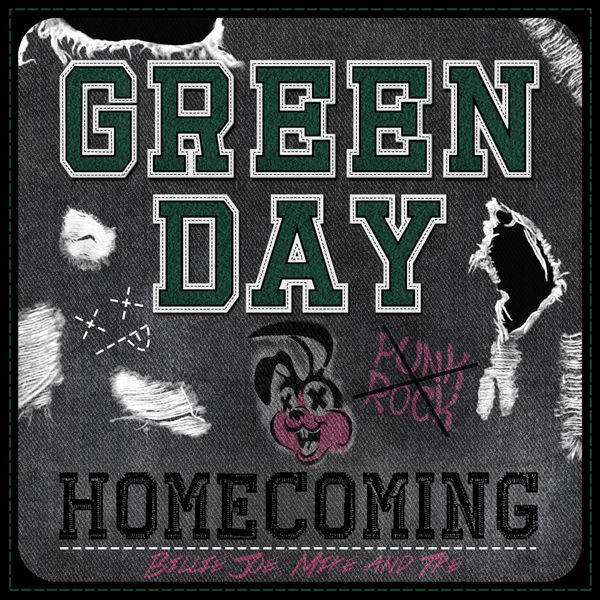
'Homecoming' is an album cover or possible single track art for the band green day. The title references a song on the 2004 album american idiot. The 3 tracks on this single would be; Jesus of suburbia, homecoming & Letterbomb which are my 3 favourite tracks from the american idiot album.
The design sent me back to a high school type feel due to the name homecoming. I used the stitch Letterman style fonts to connect the high school feel through the text but also used rough and graffiti type fonts to give it a punk feel to it as the band are primarily punk genre. I used their bunny head symbol which was also used on the awesome as f**K album. I also downloaded jean rips brushes to give the denim background extra punk and abuse to the cover.
F - Long Drive Home
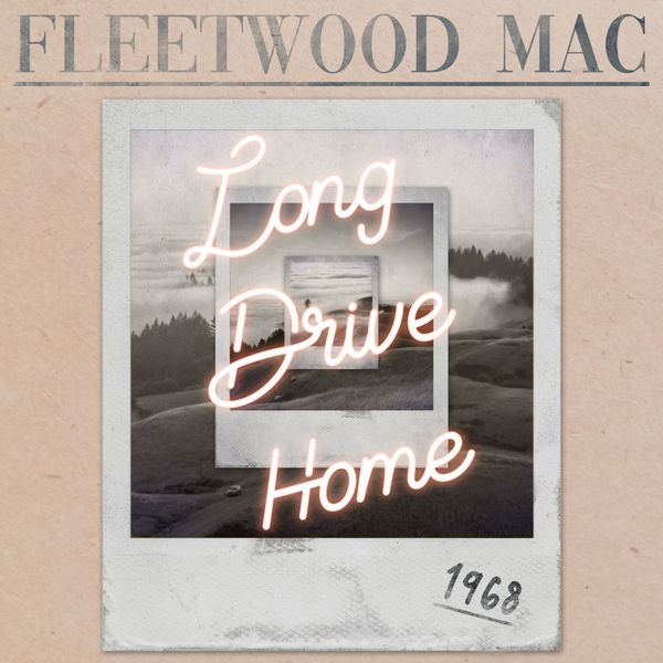
'Long Drive Home' is the next music alphabet piece. The letter F i've linked with Fleetwood Mac, A band that dominated the 70's and 80's especially with their 1977 album 'rumours'.
I set a project to create a reunion album as the band had split in 1995 but rejoined in 1997 partially for shows. The designed has current design aspects like using bold serif fonts with a pastille colour palette. Polaroid photos are also a very vintage feel which were unsplash photos aged with filters. The neon lettering is a more common thing which has become stylish with simple words and phrases. The reason behind the title was to represent a long time coming for this album and depicting the members being separated for many years to final take the long journey back to being together.
E - Take It To The Limit
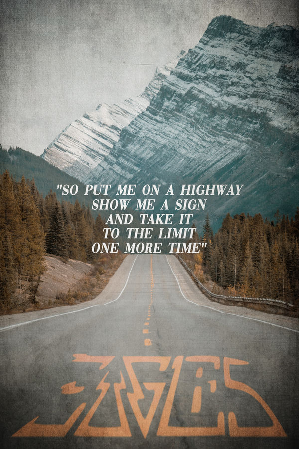
the next music based piece alphabetically is 'E'. 'Take it to the limit' is a song title and lyrics by the Eagles. This has to be a top favourite track for me by the band with other songs like 'Hotel California' and 'lyin' Eyes' also being outstanding tracks. The band dominated the charts in the 70's and has one of the best selling albums of all times (Their greatest hits 19-71-1975) which has been known to surpass Michael Jackson's Thriller album.
The piece followed a similar design from the last music based piece which where the lyrics are used as the main subject, similar to John Denver's 'Country Roads' piece below. I decided to use the chorus lyrics from my favourite song 'take it to the limit'. I selected an image to go with the lyrics and incorporated the band logo to looks like the middle lines in a highway.
D - Country Roads
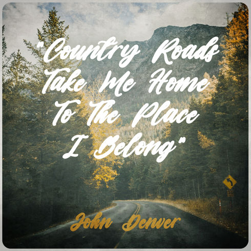
'Country Roads' is the 4th music piece following on from the Creedence Clearwater Revival Album cover and Blackberry Smoke picture record. Continuing the alphabet theme the letter D was next. I decided to use John Denver's Song lyrics and present them as an inspirational poster design. The lyrics are from his most well known song 'Take me home, Country Roads'. Released in 1971 the song only went to #2 in the charts but went platinum in 2017 due to its popularity and revival through the video game Fallout 76. This is a well known song to all ages and always gets the crowd singing along.
C - The Homeland

'The homeland' is a dedication piece to the band creedence Clearwater Revival. This is my 3rd music based design Following on from my first which was the logo and album for AC/DC. Then a picture record/vinyl for Blackberry Smoke's song 'One Horse Town'. i decided to continue the music theme and noticed I had done letters A & B, so C was next. I decided on CCR (Creedence Clearwater Revival), and set the task of designing a new album cover which possibly had a collection of greatest hits or unreleased tracks.
The design centered around the type font i selected for the band. The image used was taken from unsplash and suited the layout for the album cover. The antlers used were part of a previous stag design. A new technique used was to create a lined shadow for the antlers which was done by creating a lined pattern in illustrator and transferred to photoshop over a copy of the antler and magic wand + DLT to create the effect.
B - One Horse Town
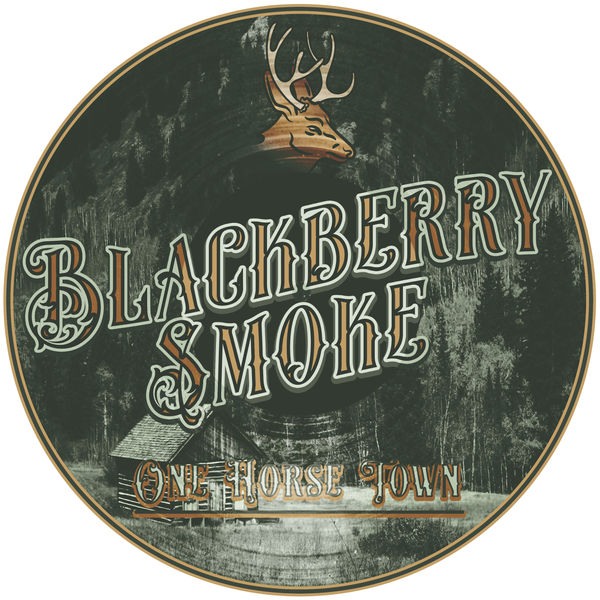
'One Horse Town' is a song by the country band Blackberry Smoke. This track is from their 2012 Album 'The Whippoorwill'. Their old time appearance and approach to country music stands out to me being a huge old school country fan.
I designed this around playing with different images as the background for 'The Stag' pub piece. The background image used above had to much of an American feel rather than old English pub, but I wanted to use the image in some way. After playing around with the effects in Photoshop the green tint over the mountain view gave an old American photo feel which I associate with Blackberry Smoke like a photo of old western America.
I then decided on a font which fitted perfectly with the aesthetic of the image. I also used the Stag illustration I used on 'the Stag' Pub design. I suddenly had the idea to try and incorporate a picture record/vinyl by adding the texture across the image and fonts which helped finalize the design.
A - AC/DC
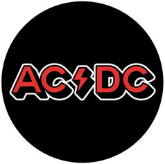
AC/DC is an Australian band which influenced my music taste from an early age. Their blues riffs mixed with gain are iconic with every guitar player. Their lyrics make you want to shout them at the top of your voice wherever you are.
My design was to simplify there more rock/metal type logo and go back to a more basic design which they used to use at the start of their career with a thin lined font, e.g. High Voltage (Australian), T.N.T., High Voltage (International) and Dirty deeds done dirt cheap.
The cover has the text in their iconic red with a black drop shadow and another drop shadow in white to highlight the band name. Live has also has the same style and drop shadows applied. I also tried an inner shadow effect with a darker red to give off a sense of depth with the text. This changed the thunderbolt for the back cover which adds depth and makes it stand out.


