

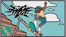
THE GAME OPINION
The game opinion is a podcast featuring Nick Burton and Jay Chamberlin. TheY approached me to do a 1930's type design for their weekly podcast episodes. Now with over 40 episodes and multiple specials I have a vast catalogue of thumbnails and illustrations.
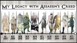
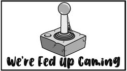
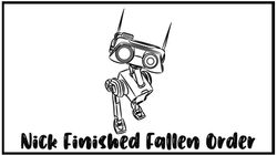
Below are some of the many thumbnails and illustrations i've created over the year with them for their podcast.
 |  |  |
|---|---|---|
 |  |  |
 |  |  |
 |  |  |
 |  |  |
 |  |  |
 |  |  |
 |  |  |
 |  |  |
 |  |
TGO SHOW LOGO
The game opinion came to me and asked for a redesign of their logo due to the new direction they were going with the podcast. They provided some inspirational ideas which was themed around the 1930's/40's/50's.
After a few ideas came to light I defined these designs to understand which definite direction I was going in. I decided with a Vegas/game show type billboard design. The shape of the billboard was decided once I had seen this design previously. Then it was deciding on what font looked best for each word and then the colour scheme. We went through many colours schemes and decided on a warmer vintage colours which fitted perfectly.
a small circle logo for social media accounts was also requested. This was the same design as the word 'GAME' in the main logo. I applied the same design and look with an additional gradient to the letter 'G' and 'o'. TGO stand for "The Game Opinion".
The newest form of illustration required was a different background for videos for certain subjects when they were discussing them on the podcast. For the NEWs I designed a 50's style type background with the globe and word news using different thicknesses of font like a gradient. The word 'FAKE' was added after it being requested by the client. I've chosen to use an anarchist type font for the word 'fake' which gives a rule breaking vibe.
Another background I designed was for other casual subjects but had more of a collage vibe so it didn't attract the eye to it as much. This was all using the same colour palette throughout to maintain consistency.


